
Looking at Data through Crystal Eyes
Nothing beats a good story. It draws you in, grabs your attention, engages your emotions, inspires you. It’s the best way to connect with your listeners and tap into their emotions, energy and commitment. The key to good storytelling is presenting ideas that are digestible, compelling, emotional and, most of all, memorable. As bite-sized morsels of experience, stories are how we remember the facts and figures that are important to us and easy to forget.
In the world of Big Data, where analytics hold sway, data visualization – presenting data or information as charts, images and other visual formats – has become a dominant visual art form that presents data in an easy-to-grasp format with charts and graphs that give us a clear picture of what it all means. Ours is a visual culture where colours, shapes and patterns are the primary means for transmitting insight into socio-economic trends and what they signify. And as our society becomes more data-driven, data storytelling grows in importance as the ideal tool for translation – making sense of our experiences by curating data into its most accessible, understandable form.
Data has profoundly changed our world. As designers, how we can improve our relationship with data, work with it more creatively and productively to be better at what we do, develop better designs, better storytelling and create more actionable experiences for people.
ArcTrn is involved in this initiative. We’re applying a user-centred methodology to help us unearth the human stories and actionable insights within data for ways to grow our relationship with information, to make it productive and a bigger part of our experience. In effect, we hope to discover how we can unearth its promise in ways that facts and figures alone can’t do. As an “In the Lab” experiment, we set out to put the data storytelling theory to the test by visualizing a pre-selected data set through a specific visual medium (in this case, crystal) to explore how repackaging data into more accessible information chunks can create greater meaning and better understanding.
The Data
In the aftermath of the U.S. election and the January 6 attack of the U.S. Capitol, it’s reasonable to believe that, on the whole, the world is growing less democratic. Is this merely our perception about the state of the world or is there a basis in reality? Every year, the Economist Group publishes its Democracy Index, which measures the state of democracy in 167 countries worldwide. The index comprises 60 indicators grouped within five categories: electoral process and pluralism; functioning of government; political participation; political culture; and civil liberties. Each country is classified as either a full democracy, a flawed democracy, a hybrid regime or an authoritarian regime based on its score. In 2021, Canada is ranked as the fifth democratic country globally (behind New Zealand, Sweden, Iceland and Norway) with a 9.24 out of 10. By contrast, the United States is ranked a flawed democracy with a score of 7.92.
The benefit of reducing “democraticness” to a single numeric score is it provides an easy-to-grasp metric for tracking democracy’s growth or decline. But what it gains in simplicity, it loses in nuance or context. For example, while the index firmly places Russia in the authoritarian regime category, it scores higher in political participation scores than many identified “flawed democracies.”
While considering the implications of these numbers, we came across Memo Pod, a data visualization project that procedurally generated a 3D sculpture using data from multiple sources collected during the 2020 lockdown in New York City. We were intrigued by its use of the different data points to guide its construction, and our team set out to apply the same logic to the five indices in our data.
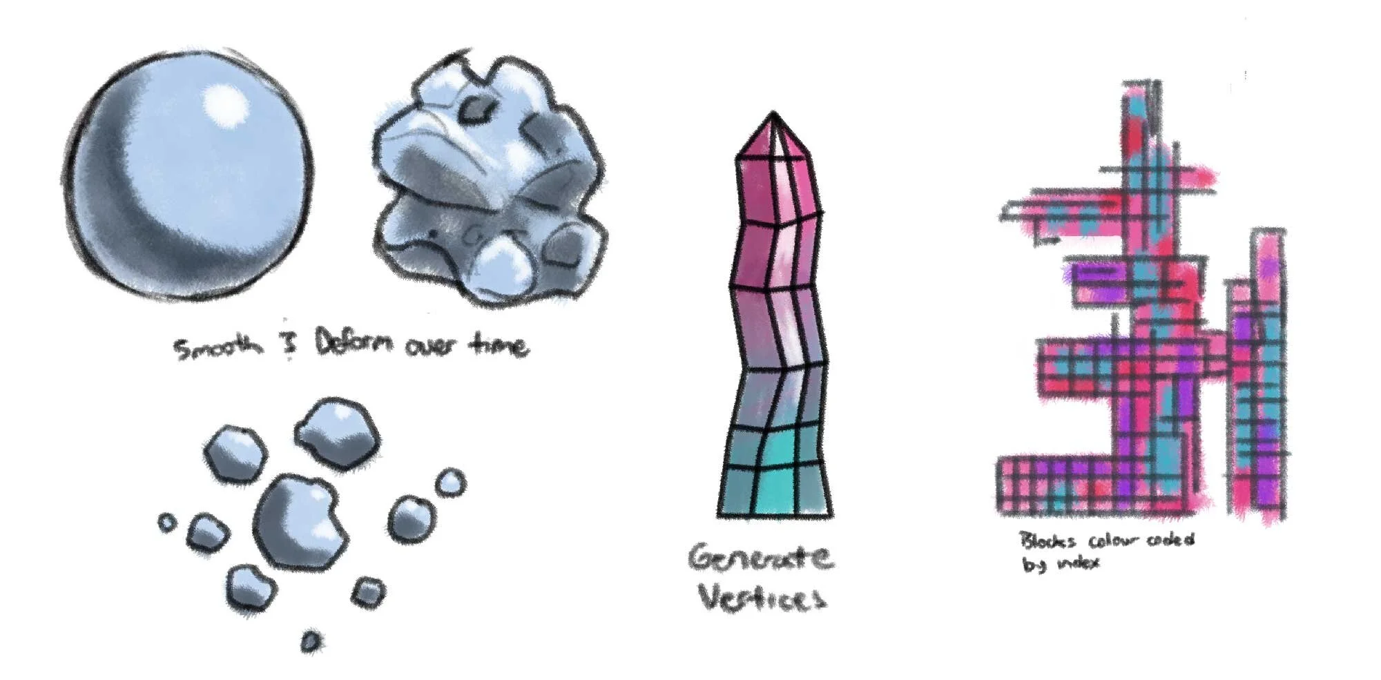
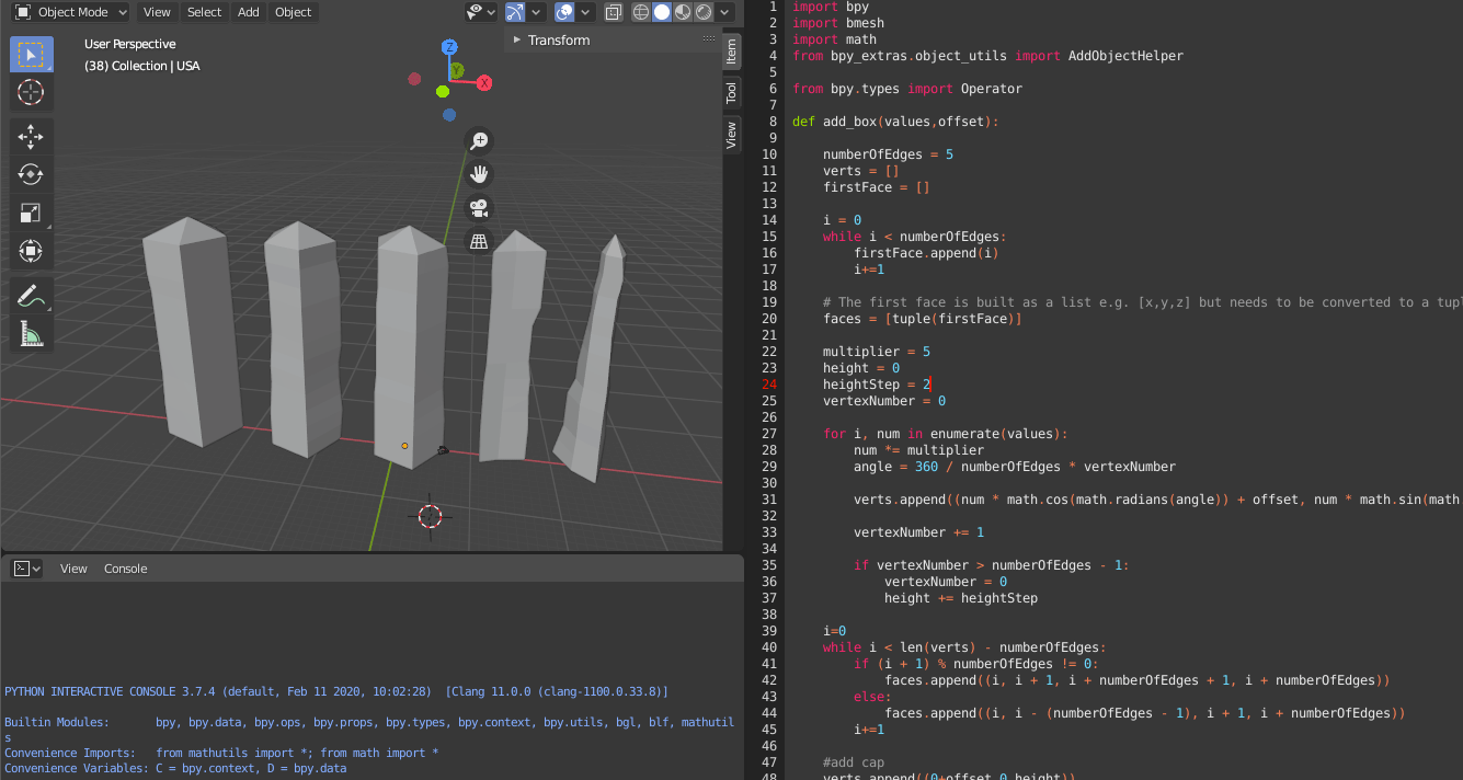
The Method
After mapping out some ideas about how our data would structure a 3D object, we settled on a crystal-like form. Each segment of the crystal would essentially be a radar chart representing a country’s five-category scores for a year. These sections could then be stacked to reflect changes in democracy over time, as the experiment's goal was to visualize trends rather than identify static values.

As a starting point, we imported Canada’s data into Blender, an open-source 3D modelling software, created a script to generate five vertices for each year and then joined them to form a 3D model. The structure could then be rotated to observe how each category score changed over time.
The Results
Canada’s crystal was stable and not very interesting, accurately reflecting that our democracy has also been pretty stable over the past 15 years. To investigate further, we added four more data sets for countries – the US, the UK, Russia and China – that featured more prominently in international news headlines and saw a lot more change.
For example, the UK score was more unstable, creating corresponding facets in the generated structure. Russia’s crystal sits on a wider base that tapers up to a point, illustrating democracy’s decline over the last 20 years. China’s structure is missing a chunk, reflecting its zero scores in the electoral process and pluralism category but having moderate scores in the four other categories.
While each of the models was interesting in their own ways, they all proved difficult to read in two dimensions, leading us to conclude that whatever format they would eventually be presented, it was important for the viewer to see them from all sides. We opted to 3D print them to overcome this obstacle, scaled them up to suit our printer bed and user translucent filament to ensure the faces would catch the light and be more distinct.
The result was five crystals standing about eight inches tall that could be handled and examined in all their aspects.


Early dance rehearsal to explore interpretation of data and sound.
The Takeaway
As ArcTrn’s foray into data storytelling, the democracy project was an important exploratory step that produced encouraging results and identified areas for further investigation. In this case, we identified several options for building on the early results and gaining greater insights. These include scaling up the amount of data used, expanding the contexts and adding more current information and programming user interactivity to enrich the overall experience.
