
I’M CLIMATE.
Are we just spectators or active participants in the climate system? For Nuit Blanche 2023, Arctrn explored this idea through a colourful light installation and interactive data visualizations generated in real-time to explore visitor perceptions of the relationship between humans and climate.
The interconnectedness of human activities with something of the magnitude of global climate is challenging to comprehend. We are inclined to create distance between ourselves and the systems we are a part of.
It is more accurate to think of ourselves as participants in a climate system. Our numbers and activities have direct and indirect influences on the system – large or minuscule, this is a fact. The objective of this project was to draw attention to the belief that we are climate-embedded and not merely spectators.

How can we grow to accept our embeddedness in the climate system?
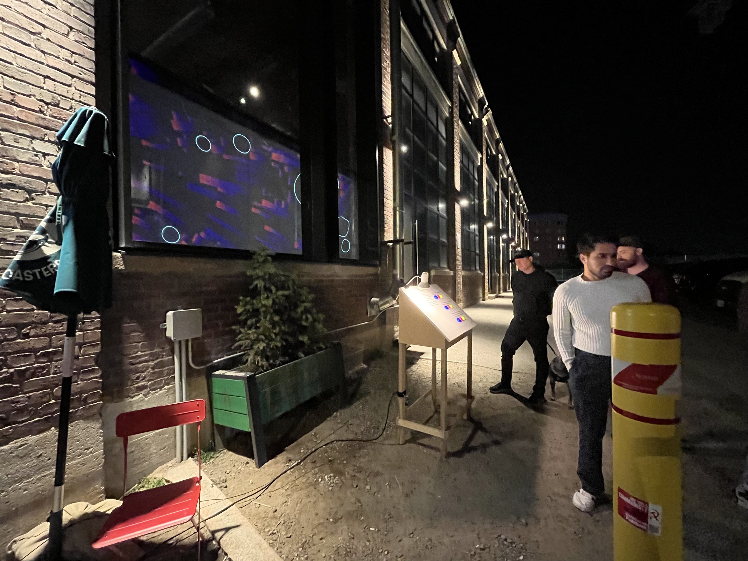
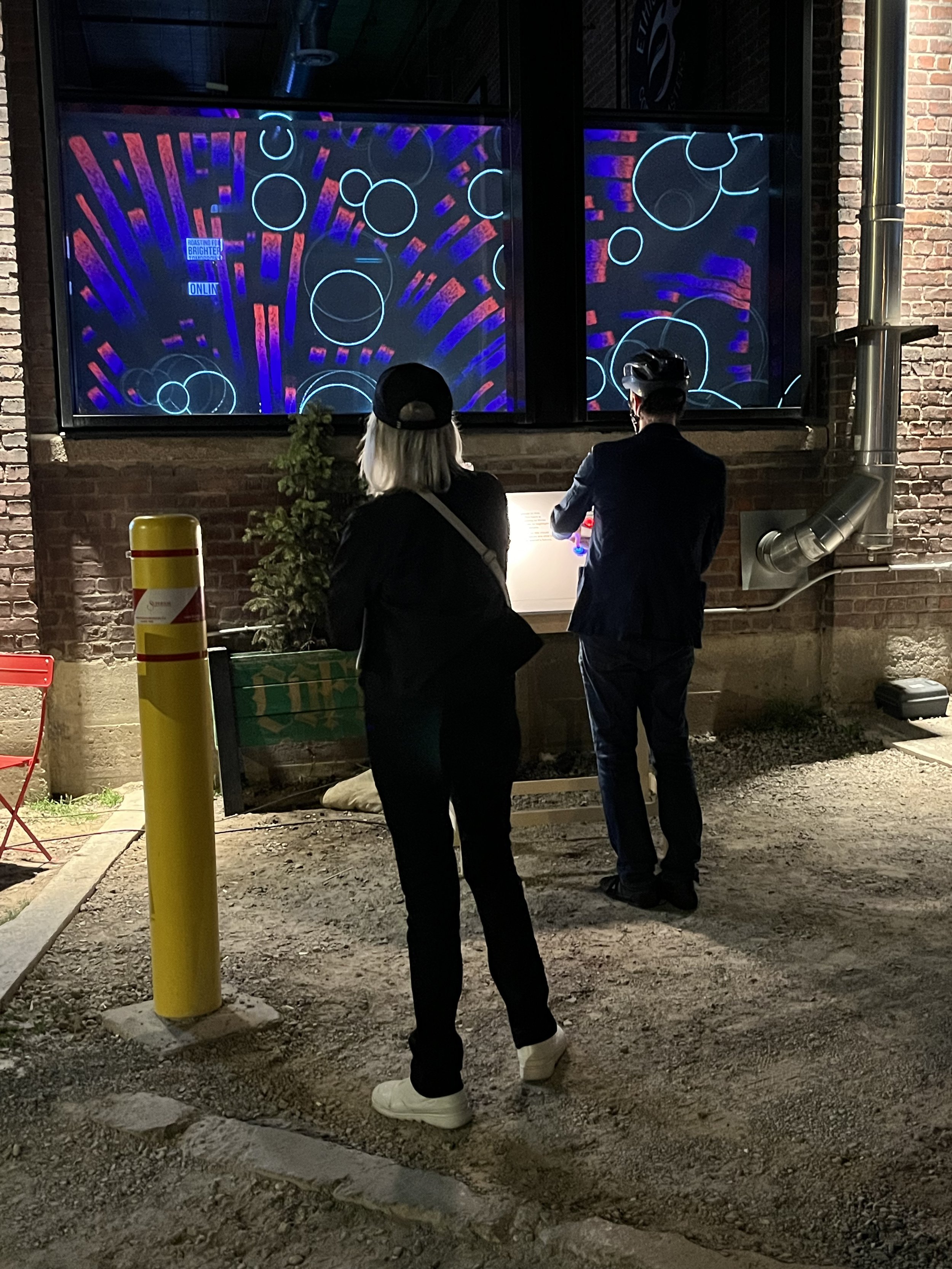
A great place to start is to simply raise the question in peoples’ minds. To do this, we asked our spectators three simple questions about their beliefs around their impact and potential to have an impact on climate change. They answered by pressing buttons that were connected to a live visualization that responded to their inputs by growing or shrinking depending on their answer—having a direct impact on the visualization, in the same way that we have a direct impact on climate change. The idea was to draw attention to the impact their beliefs have on climate change—if one believes they can have a positive impact, they are more likely to act on those beliefs and make changes in their life to do so.
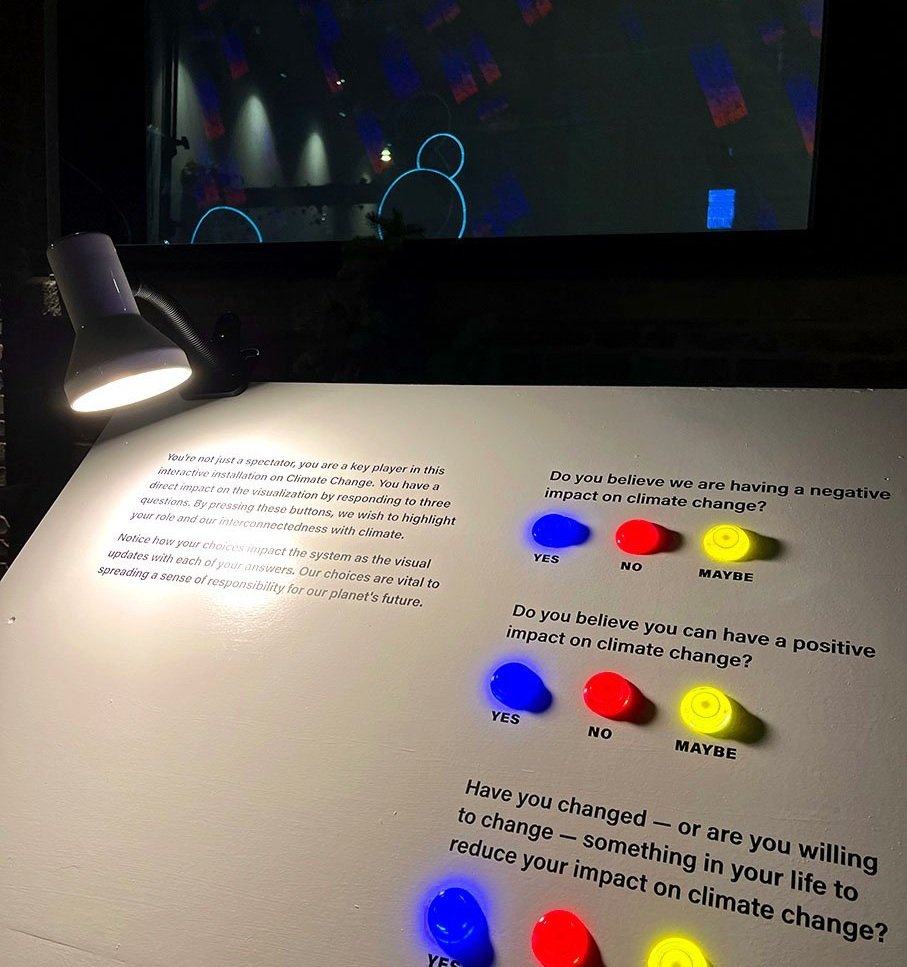
The installation kept a tally of each button pressed and at the end of the night had a count of the answers visitors had given to each question.
The results were positive, with the majority of visitors both believing that humans were having a negative impact on climate change and being open to making changes in their lives to reduce their impact.
However, a smaller number of visitors believe that they could have a positive impact on climate change.

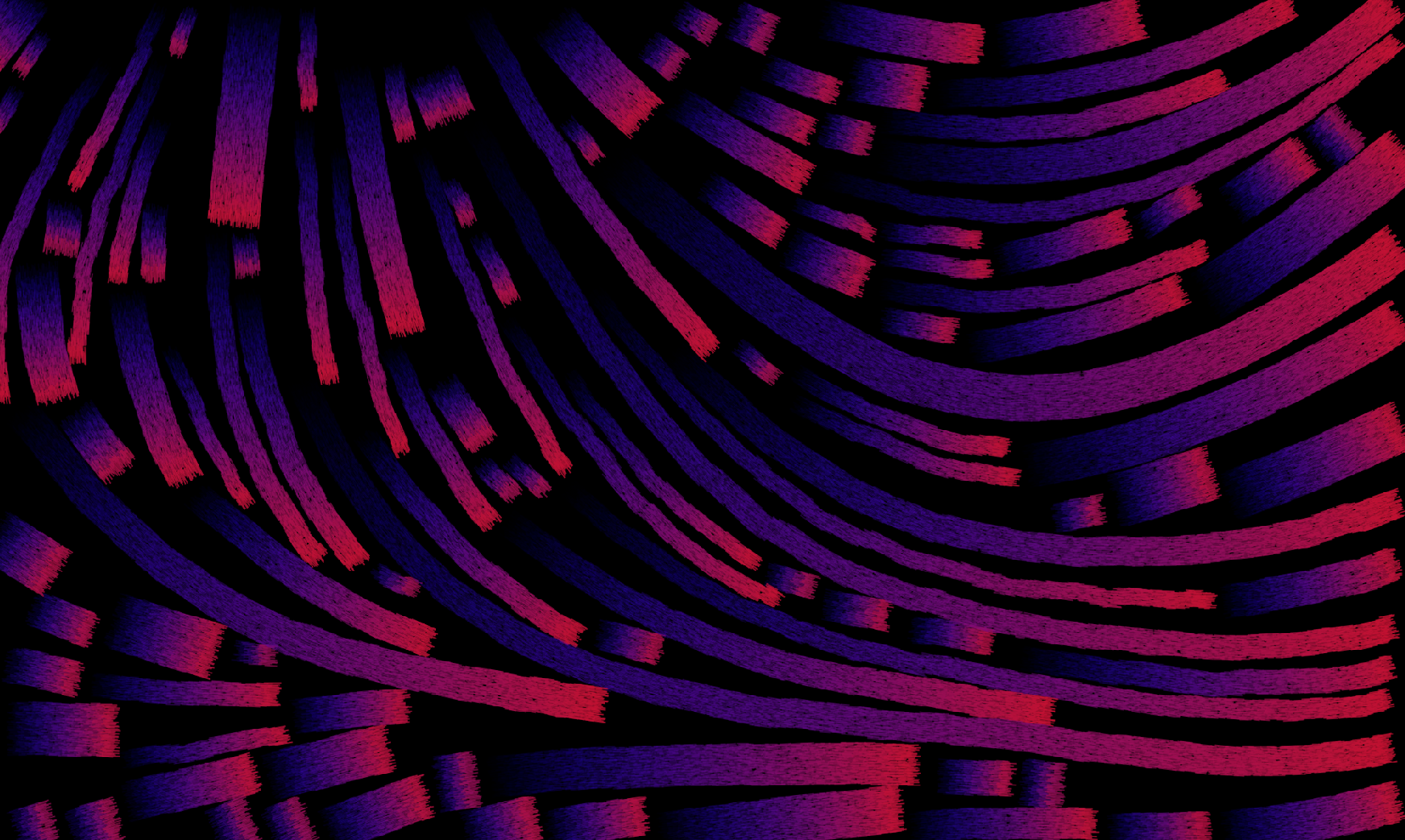

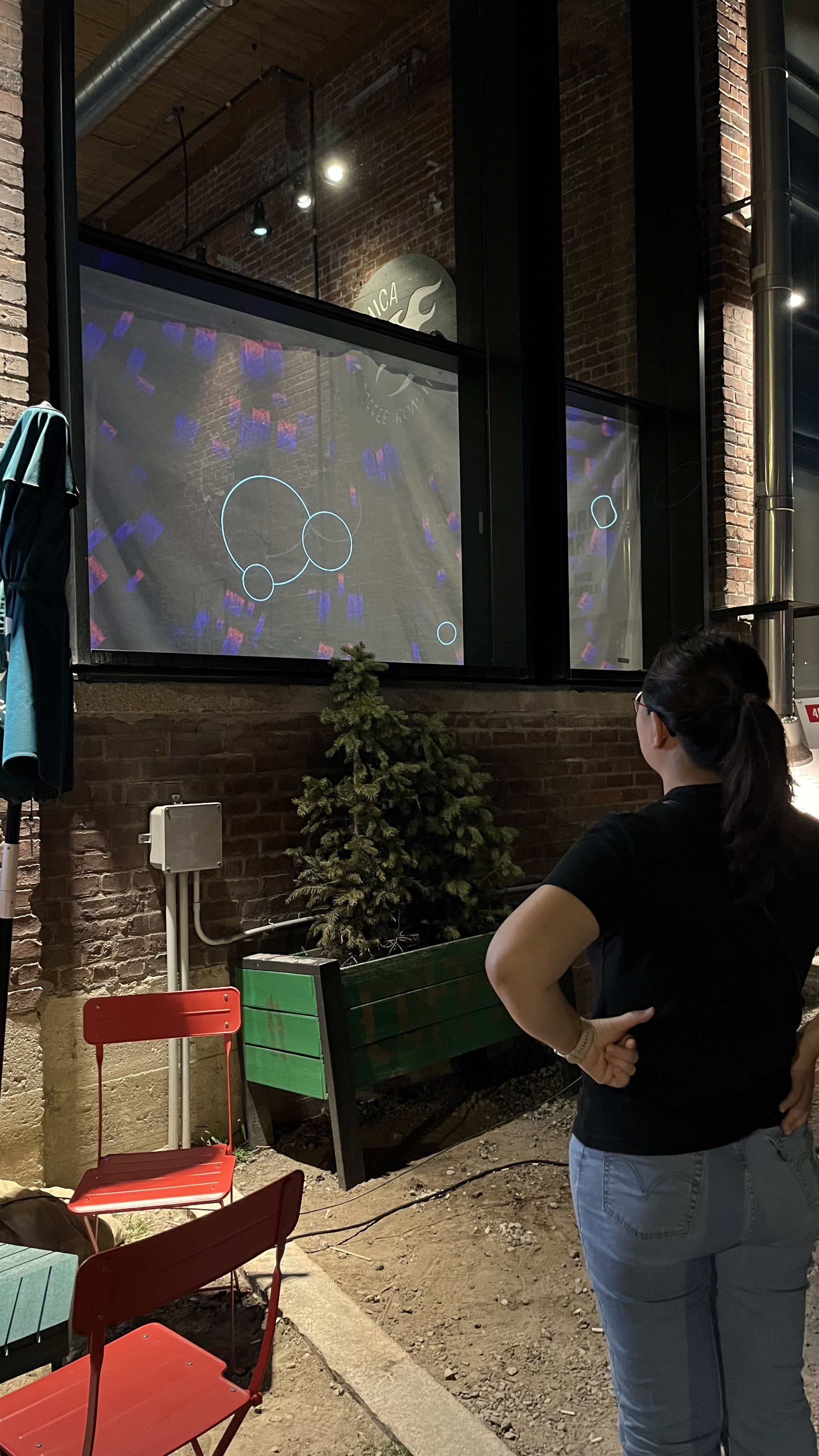
A static representation of our generative visualization installation.


Show your stripes.
Another element of our installation was an interpretation of the globally adopted Climate Stripes, originally conceived by climate professor Ed Hawkins of the University of Reading. Ed Hawkins created the Climate Stripes in 2018 to represent global rising temperatures with a series of colour bars that progress from blue, representing cooler temperatures, to red, representing warmer temperatures. The result is a snapshot of how much warmer, on average, the world has been getting in the last decades.
Climate Stripes have been produced for more than 200 countries, states and cities at showyourstripes.info, and people around the world have adopted the concept with their own interpretations widely shared on social media with the hahstag #showyourstripes.
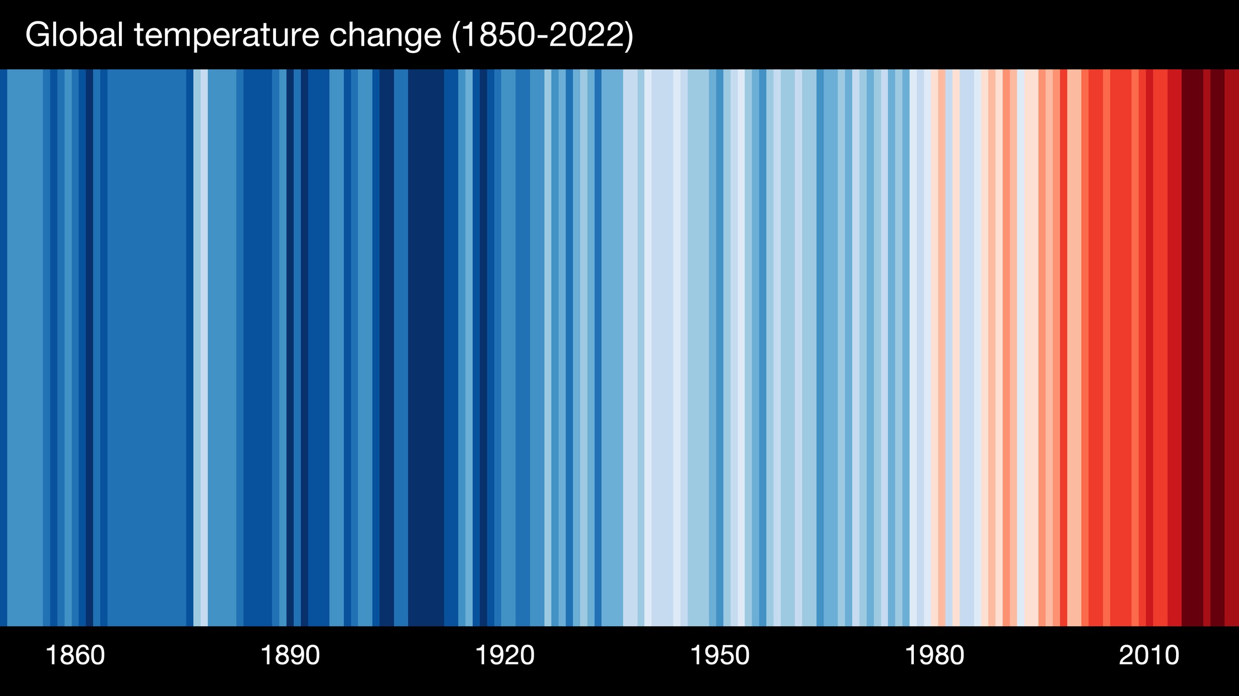
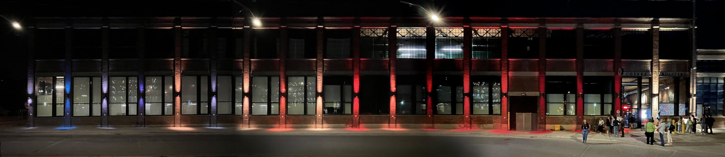
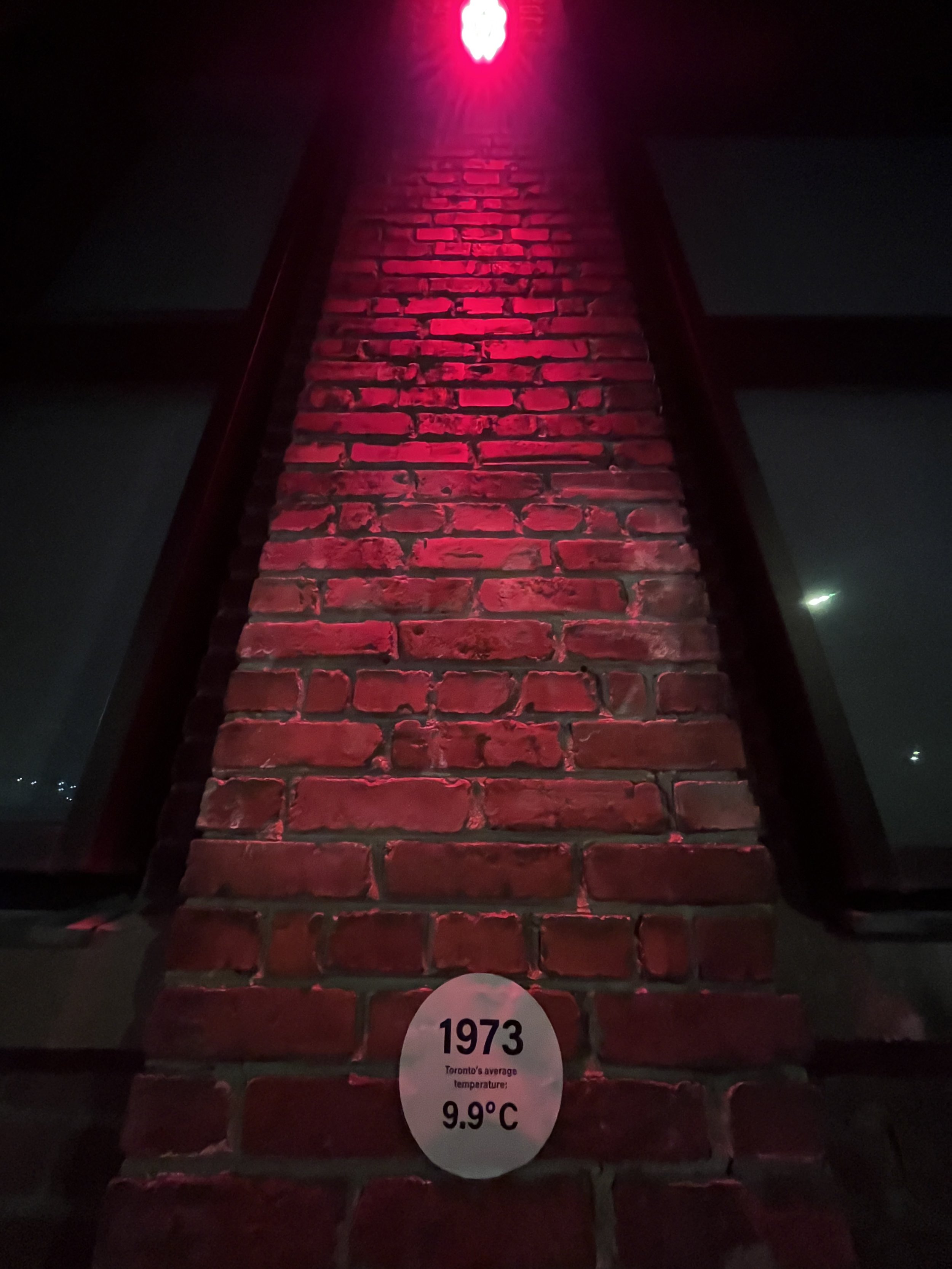
The Climate Stripes concept was so closely aligned with our objective to make visually plain our connectedness to climate that we decided to showcase Toronto’s climate stripes as part of our installation. We created a lighting display along the columns of the building beside our interactive panel, with each column flooded with variations of blues and reds representing the average recorded temperature of select years from 1841 to 2022. The temperatures ranged from 5.5°C (dark blue) to 11.0°C (dark red). Visitors could walk the length of the building to read what the year and average temperature were on each column.
What are the implications of rising temperatures? It depends on where you live; in the north, the issue may be melting permafrost or sea ice, while in Ontario, it might be extreme heat and storms in the summer and more or less snow in the winter.
With our installation, we are hopeful that talking about climate change is the first and most essential thing we can all do.


Thank you to our supporters